
When I am looking at the pictures that I take on my journey, I think I may redefine myself from „a pilgrim on a kickbike“ to „a flower photographer on a kickbike“. 😉
I am not sure, which of my skills is better or worse: my kickbiking, my flower photography or my flower identification. I am trying my best in all of them.
I added a lot of German names, as my botanical brain is more at home there.


I would place this into the borage family (DE: Raublattgewächse).


I could not decide which picture would be best. Maybe you have a favorite and want to leave a comment about that.
When comparing the pictures now, I think they contain completely different messages: the sky background one is like „I am a strong individual in the world“, the grassy background has a „I am at home here“-feeling and the last says „nature is delicate and beautiful“.
The three different messages may explain my indecisiveness in choosing one favorite. 🙂

I am a fan of the edges highlighted by light. The picture relative full with different elements, light and shadowy areas, which gives it a nice impression of „nature is rich, but everything is fine“.
Botanically I often guess such things to be in the stonecrop family (Dickblattgewächse).

When I added this image, I thought I should talk a bit about what I think about picture backgrounds, image composition and the messages the pictures may bring to the viewer.
The backgrounds are two main groups: a) a separation of a flower to give a clear focus for the eye versus b) a more wholesome presentation in their natural environment. Nearly all types of background situations occur in this article. When I see a nice flower, I decide from the environment which type of picture can be taken.
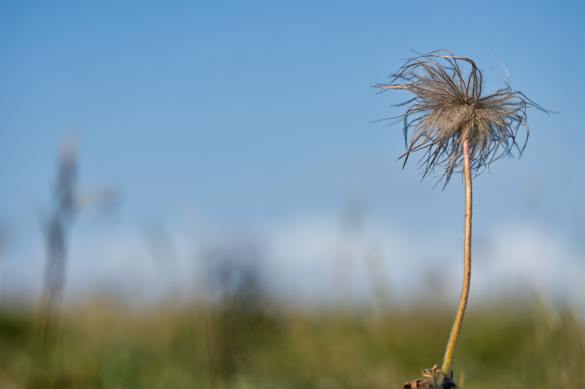
- Separation with the sky as the background.
It requires a decent amount of unobstructed sky, which often is not available in towns or when trees are around. Additionally I do a lot of flower pictures from the front or side of the flower – but when shooting against the sky often there is mainly flower backsides or odd angles to be seen. Flowers that look downward and into the camera are more difficult to find.
If cloud formations are present, their areas and edges should not interfere with the flower outlines. Arranging the flower inside a white cloud usually works.
Technically, the brightness of the entire picture has to be increased by +1 1/3 to +3 and I would recommend to have the histogram switched on and checked.
Examples here are the first Cottongrass and the second Devil’s Paintbrush picture. - A subtype of the sky background are flowers through which the light can nicely shine.
This requires thin flower leaves and it is beneficial when no flower parts are too dense. It is difficult with the dense center of the daisy family or the thick leaves of tulips, but it works fine on poppies (Mohn) or larkspur (Rittersporn).
The Devil’s Paintbrush is on the brink of that and a rare example of the daisy family where it worked. Some more pictures are in my last flower post. - Separation with a neutral background far away. This can be neutral or little colored natural habitats, but also stones or walls.
Very helpful is a wide aperture for the background to blur nicely – which is difficult with mobile phones.
Examples are the second and third Cottongrass pictures and the single Torch Lily. - Separation with a different plant species, that is not dominant.
When the background is a different plant than the flower, I often find it botanically confusing. I guess some people would not notice, but I find these images somehow not fitting.
The Thistle image is a rare example that works. - Separation with a dark background – may fall into the category of low-key.
It requires a flower in front of a shadowy hole in a bush or tree or a shadowy ground.
The darkness makes the aperture less important. It can be set narrower, thus increasing the depth of field in the flower, without the drawback of increasing the details in the background with higher sharpness – well, because it is dark. 😉 It often requires brightness tweaking deep into the minus.
The Hortensia image is of this type. - Leaves from the same species. Sometimes it is just not possible to have an image with the flower alone. The picture may be a little less focus-drawing towards the flower, but convey a higher sense of completeness.
The Curry Plant is such a picture. - Repetition of the same flower in the background.
It requires one flower to stand out from the crowd and an pleasingly distributed background arrangement. Also a brightly outstanding flower color is necessary.
These pictures often appear colorful, happy and with lots of energy. Sometimes they may be too full and too much.
The pictures of the many Torch Lilies and the many Devil’s Paintbrushes are rare examples. The Curry Plant I would not count in this category, as the yellow flowers and the silvery plant merge nicely as a kind of neutral background. - Presentation in the general natural environment, with different plants or natural ground.
This can nicely work in a natural environment, in man-made flower beds it may fail.
The difficulty is to get the background calm and pleasing enough, because often it can be messy. I often bend grasses to the side to avoid long thin lines through the picture or I remove disturbingly dominant bits from the ground.
These pictures can deliver the feeling of a rich and complex environment that is still in harmony.
The last picture from the beach with the sun around the leaves is a nice example.
A common type of flower pictures, that often mobile phone photographers do is the „oh, a nice bed of flowers! I am super impressed by this plentifulness! Lets take a wide-angle of the entire thing!“
These pictures offer too many attention points for the eye. One big and indistinguishable mess of flowers, busy, fuzzy, messy. The acute fascination of the photographer fails to transform into a lasting fascination of the image beholder. In all its over-boarding richness, they fails to contain a clear message to the viewer.
Respectively, it had the message from the photographer „I am so impressed by so much!“ but this message is very difficult in my opinion to be transported to a viewer without a huge impression of „what a mess!“ creeping in.
My explanation is that it is easy to be impressed when you are in front of a real subject with three-dimensional spacial information a) 3d-vision with two eyes, b) changing the viewing angles with your body motion, c) changing focus at will. But this real-life information is lost in a two-dimensional flat, fixed time-point, fixed focus picture! My advice: close one eye! If this removes a lot of the three-dimensional feeling, well that is how flat and boring or even messy your picture will look like.
Concluding, I am just not a fan of indistinguishably messy flower pictures. 😉
How much time do I spend with one picture? I would say 5 to 10 minutes for each of the pictures here. A third of the time is spent searching for the right flower and background and thus the type of image. The rest is setting and trying out aperture, focus, brightness and specific background arrangements as well as occasional background corrections (bending plants away).
Sometimes I find very nice flowers, but the surrounding and background do not please me enough to take a picture. It is frustrating, when I stand in front of the flower, but it saves me the frustration of going through mediocre pictures on my computer later on. 😉

Here you have this „sky background“ type of picture.
The left flower could have been a lower and more to the left. There must have been something preventing this, probably other flowers coming into the frame.
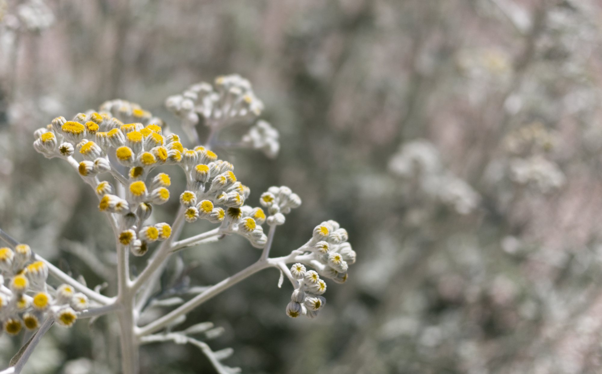
My reader Kerstin guessed it to be the Curry Plant (Currykraut) from some sister family. Based on the silver shine of the plant this seems to be a closer hit.
Plants with a silver or grey appearance are seldom and unusual and thus spark some attention.
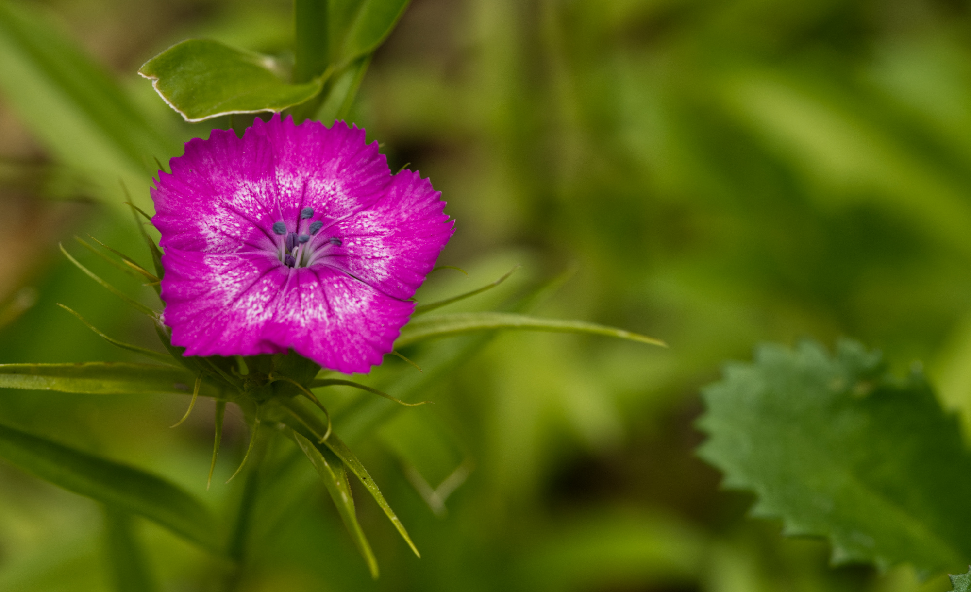
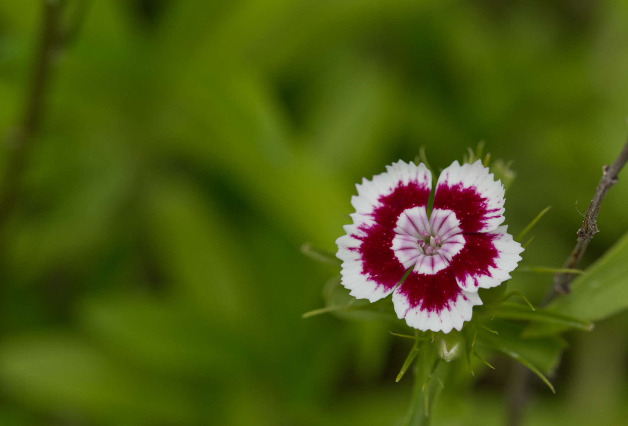
To be honest, I find most cultivars of Dianthus (Nelken) cheesy. They are – for my minimalist soul – over the top. And half of the Dianthus flowers are plain color. I find it difficult to find nice Dianthus flowers for pictures. I got lucky right in Freetown Christiania in the middle of Copenhagen with the series of the next pictures.
The leaves belonging to the flower are clear and thus the leaves of two other plants do not confuse botanically, but are just part of the green surrounding.


And to be honest, torch lilies are an easy object for beginners. The flowers are always high up, which often offers far away, unsharp backgrounds or plain backgrounds, such as this white wall.

But can you see how long it takes to find the particular focused flower? The other flowers should more or less be background and add to the impression of space and the size of the entire scene.
The picture was wider left and right, but that was too crowded. I cut it down until it got visibly digestible. I am still not sure, how well this picture compares with all the others. Rather than calming down, it appears busy. Okay, it also appears happy and lively.

Here we have this very dark background.
There is also some sharpness decrease throughout the flower, which I use sometimes for the feeling of depth.
The message of this picture is a „look at me, there are exciting things to come soon!“.

It looks like „nature is wide and wild“.
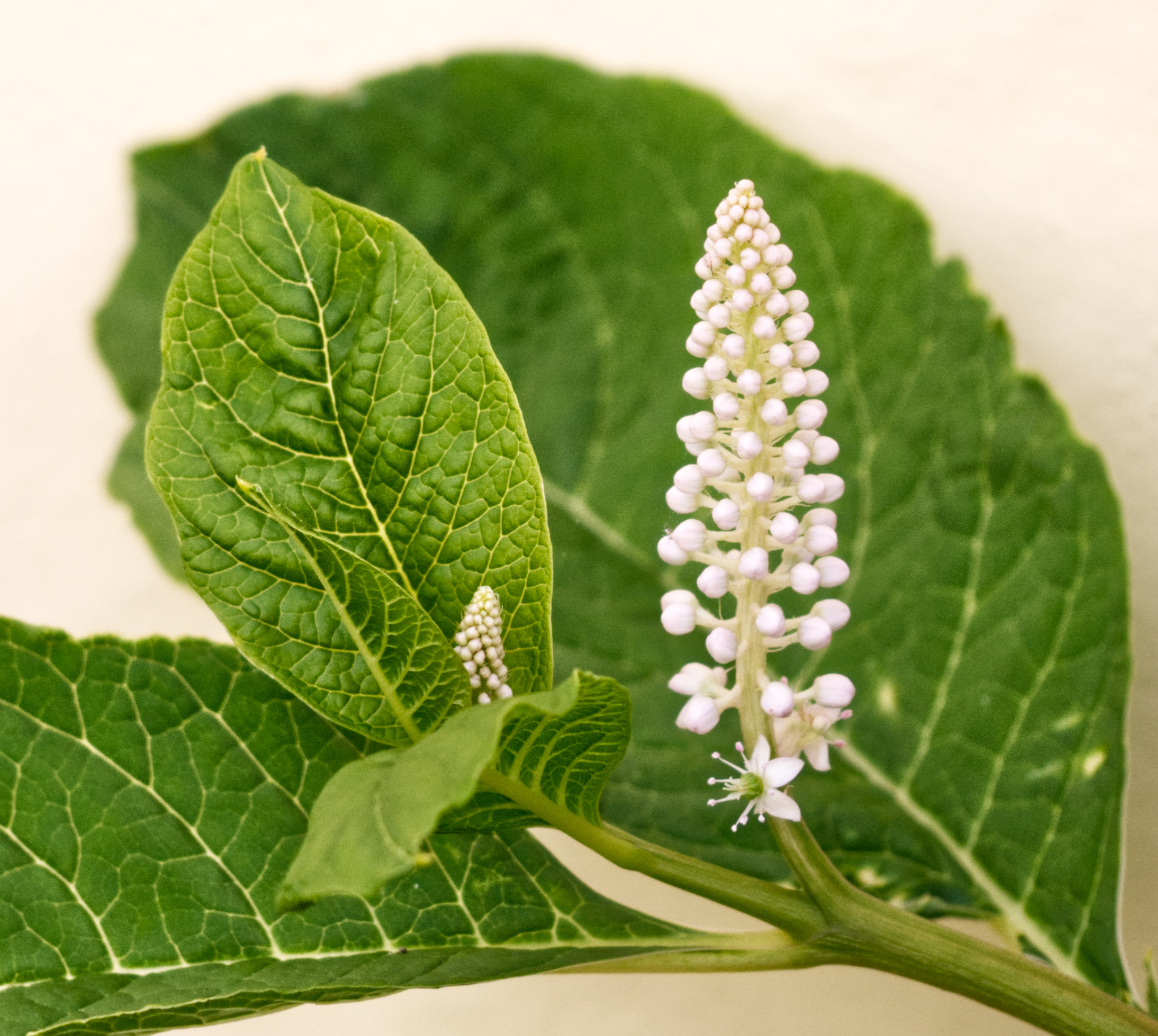
Interestingly enough, the focus is on the leaf and the flower structure is merely a half-interesting side object.
It is the image type of filling the entire picture with different parts of one plant. Botanically nicely complete – but I still would not hang it into my living room. 😉
The last picture today is a gentle beauty, nice and calming:

Background type is random green, far away and blurry. This is always a good choice.
That is it with my flower pictures from Denmark. I hope you enjoyed the pictures, and maybe learned some botany or some of my flower photography principles.
Feel free to leave a comment. Especially if you have better botanical knowledge than me, liked some particular images or have photographic or general remarks!
See you soon,
Peter

Your work is quite beautiful. As a flower photog fanatic, focused mainly on novel writing, I blog here and there with a piece from my photo journal. I appreciate your tips of the trade!
LikeLike
Hi Erika. Nice to see that you liked the article and gained something from it. Nice website of yours as well and nice to see that you are spreading creativity to others – it is a very valuable gift that should be embraced, celebrated and shared far. 🙂
LikeGefällt 1 Person